Here we are going to discuss a few lettering ideas for windows. Use the styles we discussed to create professional looking vinyl letters for storefront windows and business class graphics. We understand how hard it can be to come up with a good layout for your letters. This simple guide will help you come up with some ideas on how to design your window lettering.
Proper Size is Important
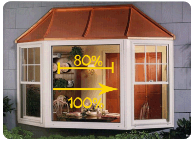
As with most anything the 80/20 rule applies. The optimal sizing of your lettering for windows should take up about 80% of the surface you have available. This can be any window surface such as a glass door, your store window, or even a truck window. Take the total width available and multiply it by .8 and you will get your rough optimal size to design your lettering at.
The size you choose to design your window lettering is really one of the most important things you can determine. Make the lettering too small and your your customers won't be able to read it from a distance, too large and it will look over done and out of place. The 80% rule is a good guideline as to what width to use for your window letters.
