Certain Fonts Work Better Than Others
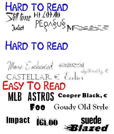
There are a few things to consider when you pick a font for your window lettering. First off is what distance is the window supposed to be viewed from? For short distance viewing such as a glass door entrance the letters you choose can be more flexible since viewing distance isn't a concern. In this situation we would recommend picking fonts from the bottom and middle section of the image below (just some samples). Using fonts from the top section for business windows may look cool, but you still want people to be able to read them. They certainly have their place on our site for other applications, but we are just giving some ideas to do a good window design.
The second scenario and most common is a window storefront design that is to be viewed from a longer distance. In this case obviously you want to follow the 80/20 rule from above. That is only half of the battle though. Look at the vinyl lettering image below to get an idea of what fonts work well and which ones don't. They are intentionally scaled down somewhat to give you an idea of what they would look like attached to a window. The top section is various novelty fonts we have on the site, we really don't recommend these types of fonts for a storefront window. They have their use, but we don't recommend fonts in vinyl for this. The second set while looks good is very difficult to read even from a short distance away. Both because the letters are very thin and because they are in a cursive script style. Finally the last section is a few choice fonts that work well viewed from a distance in general. Not just on a window, but on anything. Notice how the font is all around thicker and bolder than the others.

Use our window design tool to design your window letters in the fonts above in minutes. We also feature a step by step window design section perfect for getting window letter ideas. Visit our Window Lettering Ideas Section right now!